How to Choose the Perfect Colour Palette for Your Art

Hey, fellow artists! 🎨 Are you ready to dive into the colourful world of abstract art? Choosing the perfect colour palette can be a game-changer for your artwork. It's like picking the right outfit for a special occasion—only with more splatters and a lot more fun! Let's explore how you can create stunning colour palettes that make your abstract art pop.
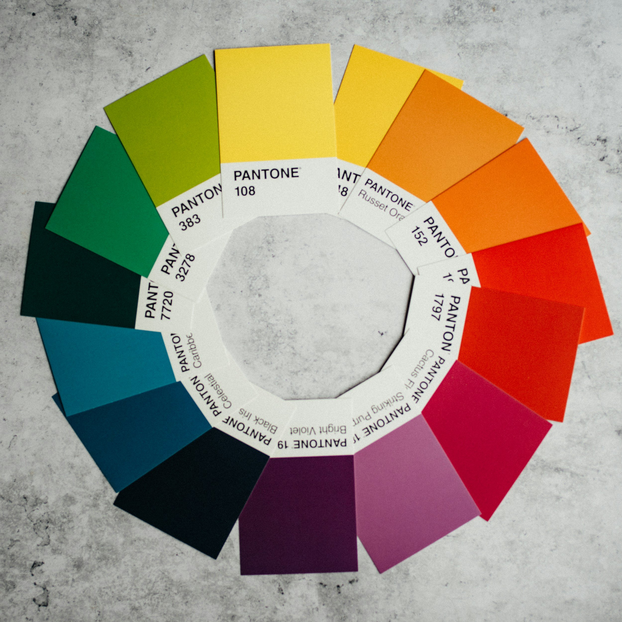
1. Understand the Basics of Colour Theory
Before we get into the nitty-gritty, let’s brush up on some colour theory. Don’t worry, it’s not as scary as it sounds!
Primary Colours: Red, blue, and yellow—the holy trinity of colours. Mix these to get secondary colours.
Secondary Colours: Green, orange, and purple—born from primary colour mixing.
Tertiary Colours: These are a combination of primary and secondary colours (like red-orange or blue-green).
Understanding how these colours interact helps you create harmonious and striking palettes. The best way to gain an understanding is to play with colour mixing yourself.
2. Find Inspiration for Your Colour Palette
Inspiration is everywhere—sometimes you just need to look around with a fresh perspective.
Nature: The ultimate artist! Check out flowers, sunsets, oceans, and even those funky mushrooms in your garden.
Art: Browse through art galleries, museums, and even Pinterest. Other artists’ work can spark new ideas.
Fashion and Design: Colour trends in clothing and interior design can offer surprising and fresh palettes.

3. Consider Mood and Emotion
Colours speak louder than words, especially in abstract art. Think about the mood you want to convey.
Warm Colours: Reds, oranges, and yellows can evoke warmth, energy, and passion.
Cool Colours: Blues, greens, and purples are calming and soothing.
Neutrals: Whites, blacks, and greys can balance your palette and add sophistication whilst allowing the other colours to really pop.
Choose colours that reflect the feeling you want your viewers to experience.

Warm colours lead a viewer to feel warmth or passion.
4. Experiment with Colour Combinations
Once you have mastered the basics it’s time for the fun part—playing with colour combinations! Here are a few things to try but the possibilities are endless.
Analogous Colours: These sit next to each other on the colour wheel (like blue, blue-green, and green) and create serene, harmonious effects.
Complementary Colours: Opposites attract! Pair colours from opposite sides of the wheel (like red and green) for a vibrant contrast.
Triadic Colours: Pick three colours evenly spaced around the wheel (like red, yellow, and blue) for a balanced and dynamic palette.
Don’t be afraid to mix and match until something clicks.

Yellow and purple are another classic complementary colour combination.
5. Make Your Colours Harmonise
Follow this link for my easy guide on how to make your colour palette harmonious every time, no matter which colours you choose. This will give your art that something special and a more sophisticated look.

6. Use Tools and Resources
Why not let technology lend a hand?
Colour Palette Generators: These generators create instant colour ideas and inspiration. Websites like Adobe Color and Coolers can generate stunning palettes in seconds.
Swatch Books: Swatches allow you to visualize and feel colours before using them.
Apps: Apps like Pantone Studio and Color Snap can help you visualize and experiment with colours digitally before you create them.
These tools can save time and give you fresh ideas.

7. Trust Your Instincts
At the end of the day, trust your gut. Your unique artistic voice is what makes your art special.
Go with What Feels Right: If a colour combo excites you, go for it!
Break the Rules: Sometimes, the most stunning pieces come from happy accidents and daring choices.
Stay True to Your Vision: Remember, your art is a reflection of you. Embrace your style and let your instincts guide you.

Choosing the perfect colour palette for your abstract art is a journey filled with exploration and creativity. Remember, there are no strict rules—just guidelines to help you find what resonates with you. So, grab your brushes, trust your instincts, and let your colours fly! Happy painting! 🎨✨